Take a look at this picture I took in the mall, in particular the Reitmans, Stokes, and Carleton Cards stores (left to right accordingly): 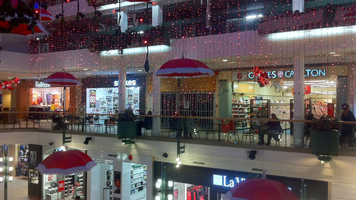
The stores look very different, mostly due to the colour of light they've used. In the Carleton Cards, there's a yellow light, adding a bit of warmth to a store built around relationships and expressing feelings. Stokes (a kitchen store) uses a very clean, white light, appropriate for clean kitchens, and pushing that meme. Reitmans (a clothing store) uses a rose coloured light which improves the look of skin for most people (especially us pasty Caucasians in the middle of winter).
Just another way stores are marketing to you that's easy to miss.
Comments »
No Trackbacks